CliquePrize
Realigning Product Design Around Small Business Owners

OVERVIEW
CliquePrize's marketing website wasn't connecting with its core audience: small business owners. I redesigned the entire site to speak directly to their pain points, replacing vague messaging with clear value propositions.
Role: Product Designer
Team: Sole Designer
Timeline: Nov-Dec 2025 (2 months)
IMPACT

THE PROBLEM
Product Had Drifted from Its Core User
CliquePrize needed to refocus on small business owners, the people who run local shops, boutiques, and, restaurants using rewards to retain customers.
The existing design wasn't built for them.
MY APPROACH
Understanding What Small Business Owners Actually Need to Know
I redesigned the site from the perspective of a busy shop owner visiting for the first time, asking:
What is this product?
Is it for me?
What problem does it solve?
How much does it cost?
Can I trust it?
To find the answers to these questions, I conducted competitive analysus to understand how similar businesses caterd to their target users.
Competitive Analysis
Persona
CREATING THE DESIGN SYSTEM
Building a Foundation: Design System with 15+ Components
While designing ClickPrize from the ground up, I saw inconsistencies emerge across colors, components, and layout patterns as the product scaled. To prevent design drift, I created a centralized design system with 15+ reusable components, making handoff to engineers faster and onboarding a new designer significantly smoother.


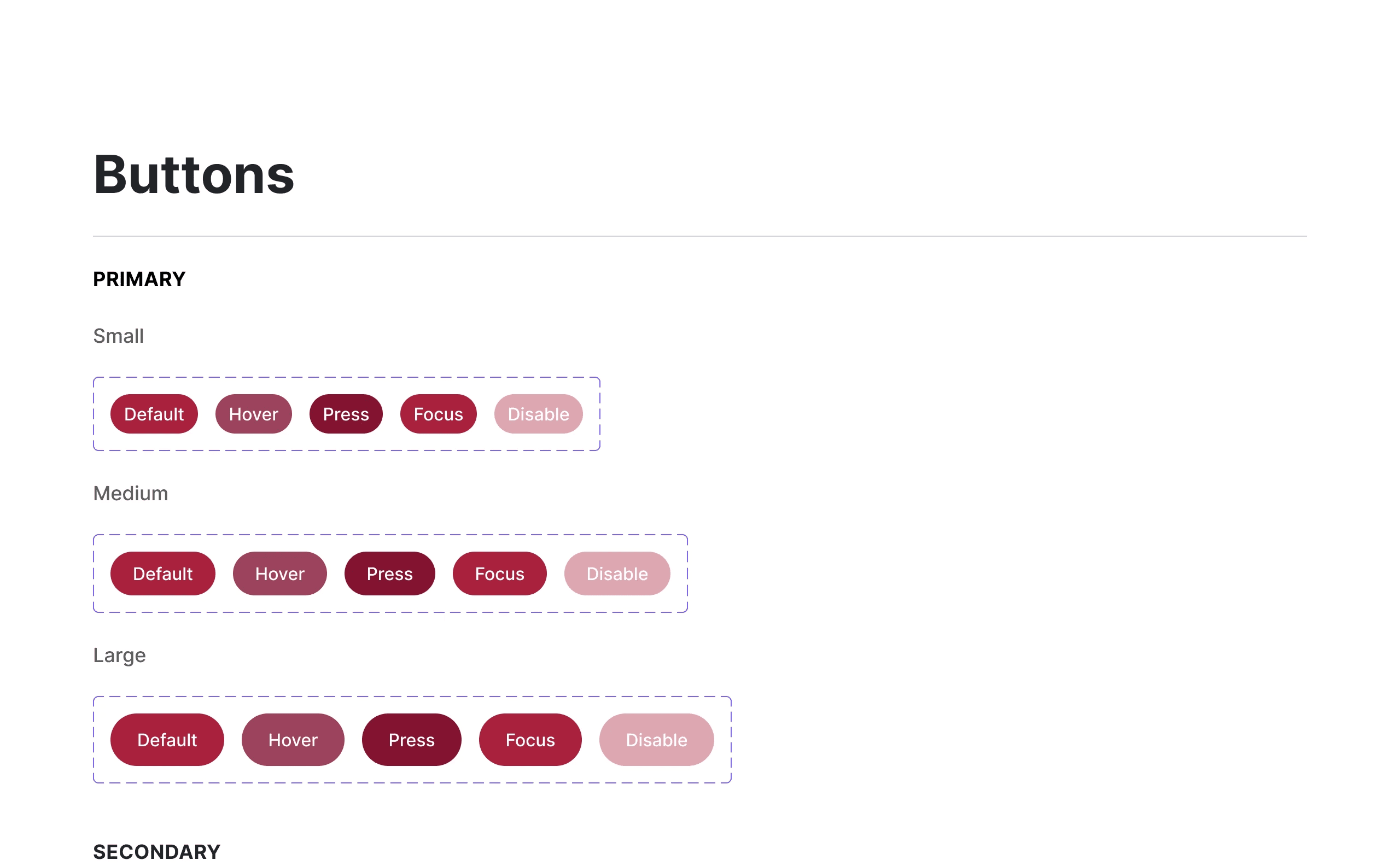
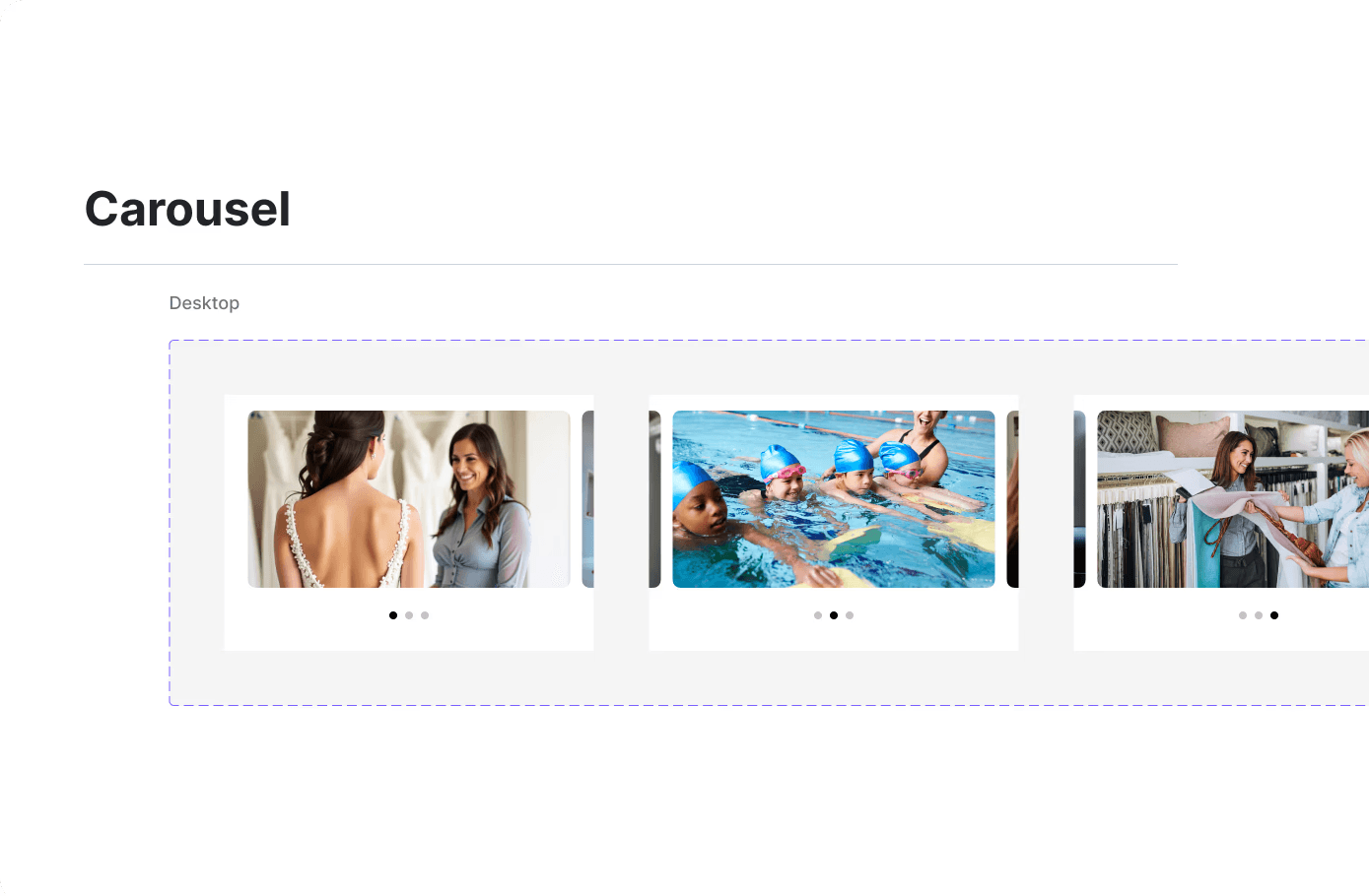
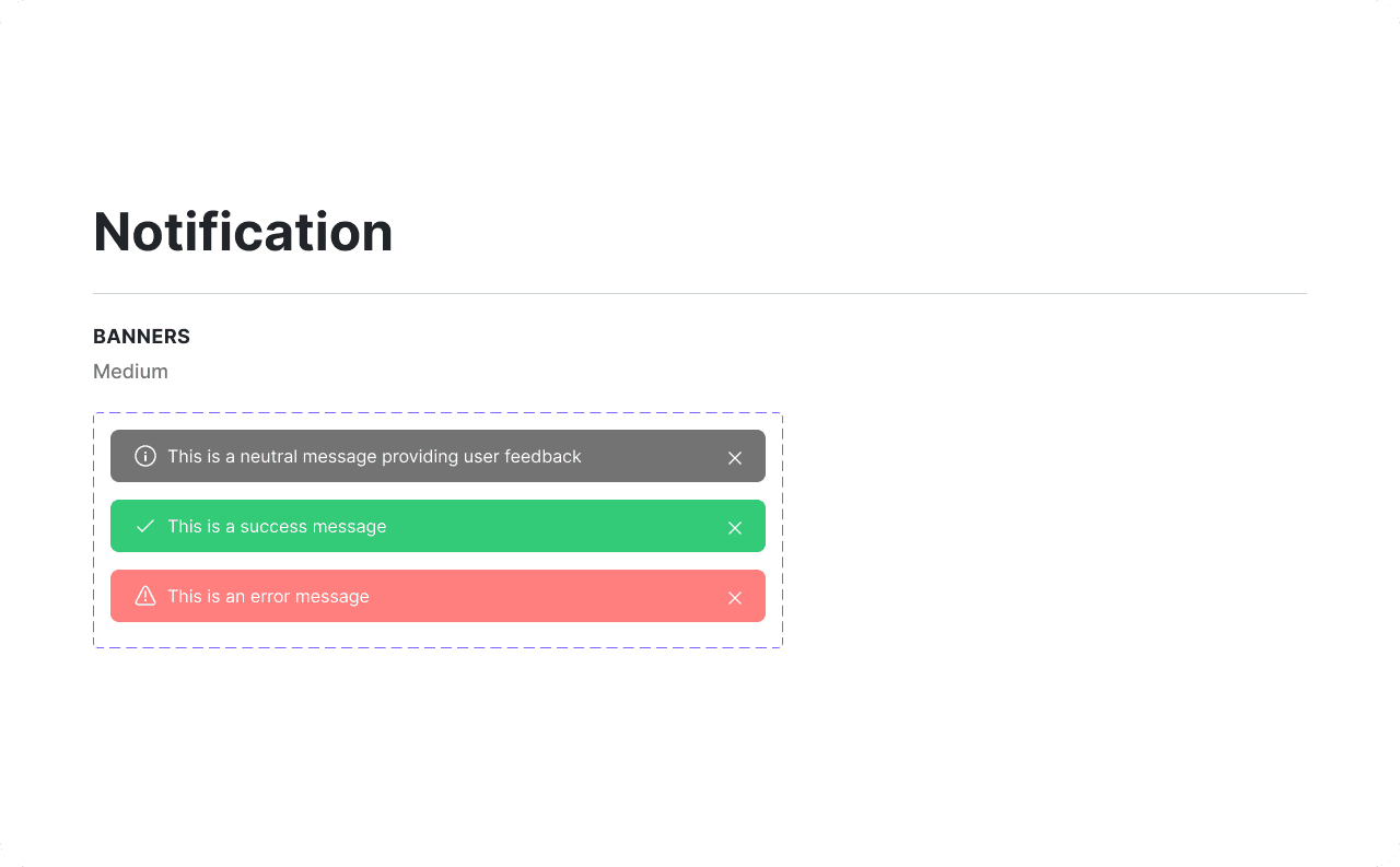
Design system components
SOLUTION: KEY CHANGES
Instant Clarity: Headline That Speaks to the User
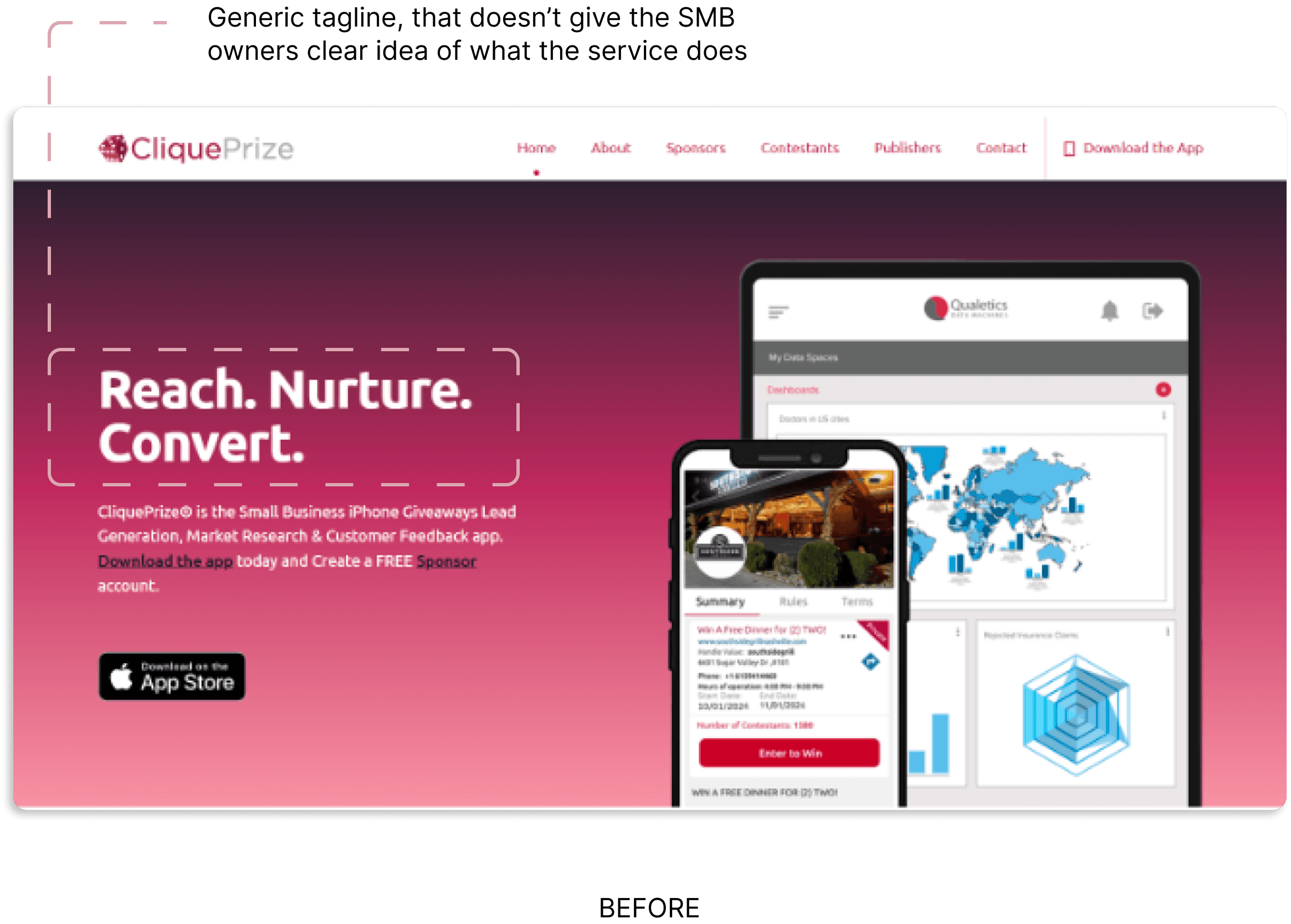
During competitive analysis, I found that successful SMB-focused platforms like Square and Mailchimp use ultra-specific headlines that immediately communicate both what the product is and who it's for. Generic taglines like "Reach. Nurture. Convert." could apply to any marketing tool, this creates cognitive load for visitors who need to read further to understand relevance. The new headline passes the 5-second clarity test: a busy business owner knows instantly whether this product is for them.

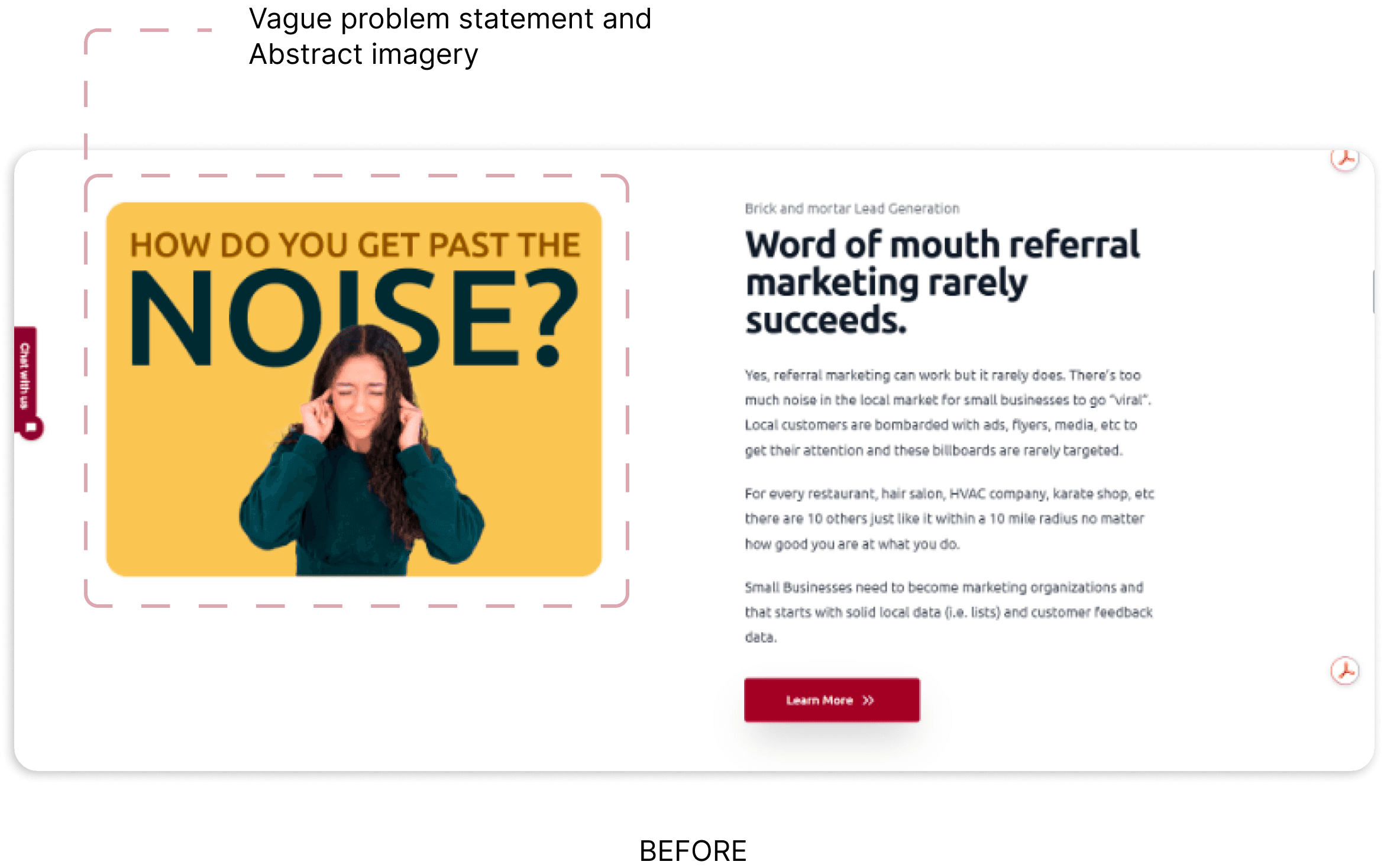
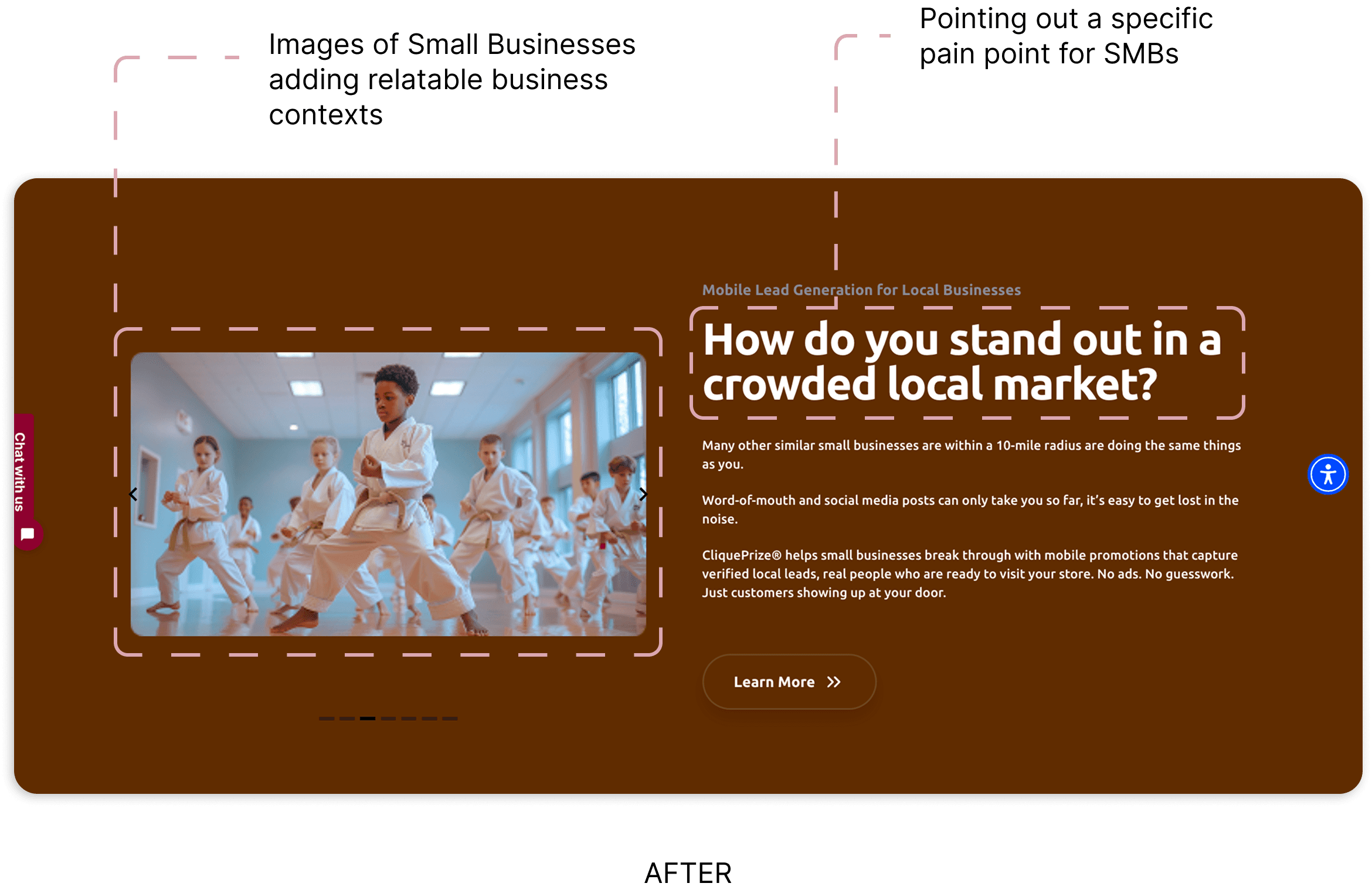
Problem-Focused Messaging: Speaking to Real Pain Points
In user research with small business owners, I found they don't think in abstract terms like "noise", they think in concrete business challenges: foot traffic, local competition, customer retention. Competitors like Toast and Shopify ground their messaging in specific, tangible problems their audience faces daily. This reframe makes the problem immediately recognizable and creates stronger emotional resonance with the target user.
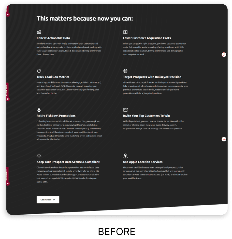
Visual Explanations: Reducing Text-Heavy Sections
Eye-tracking studies show users scan rather than read on marketing pages, especially busy business owners evaluating multiple tools. Competitors like Constant Contact successfully use icon-driven layouts that communicate value in seconds.
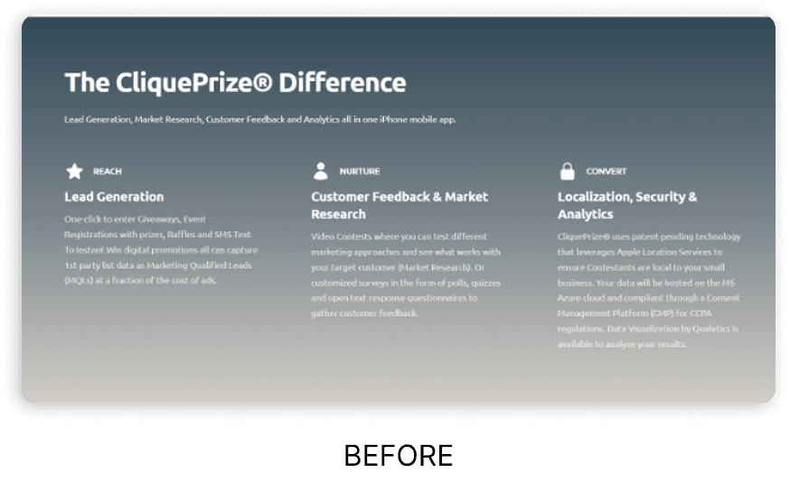
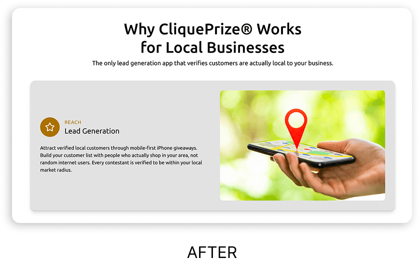
I paired each visual with brief, benefit-focused copy to ensure clarity. This hybrid approach tested better in early feedback sessions, striking the balance between scannability and comprehension.
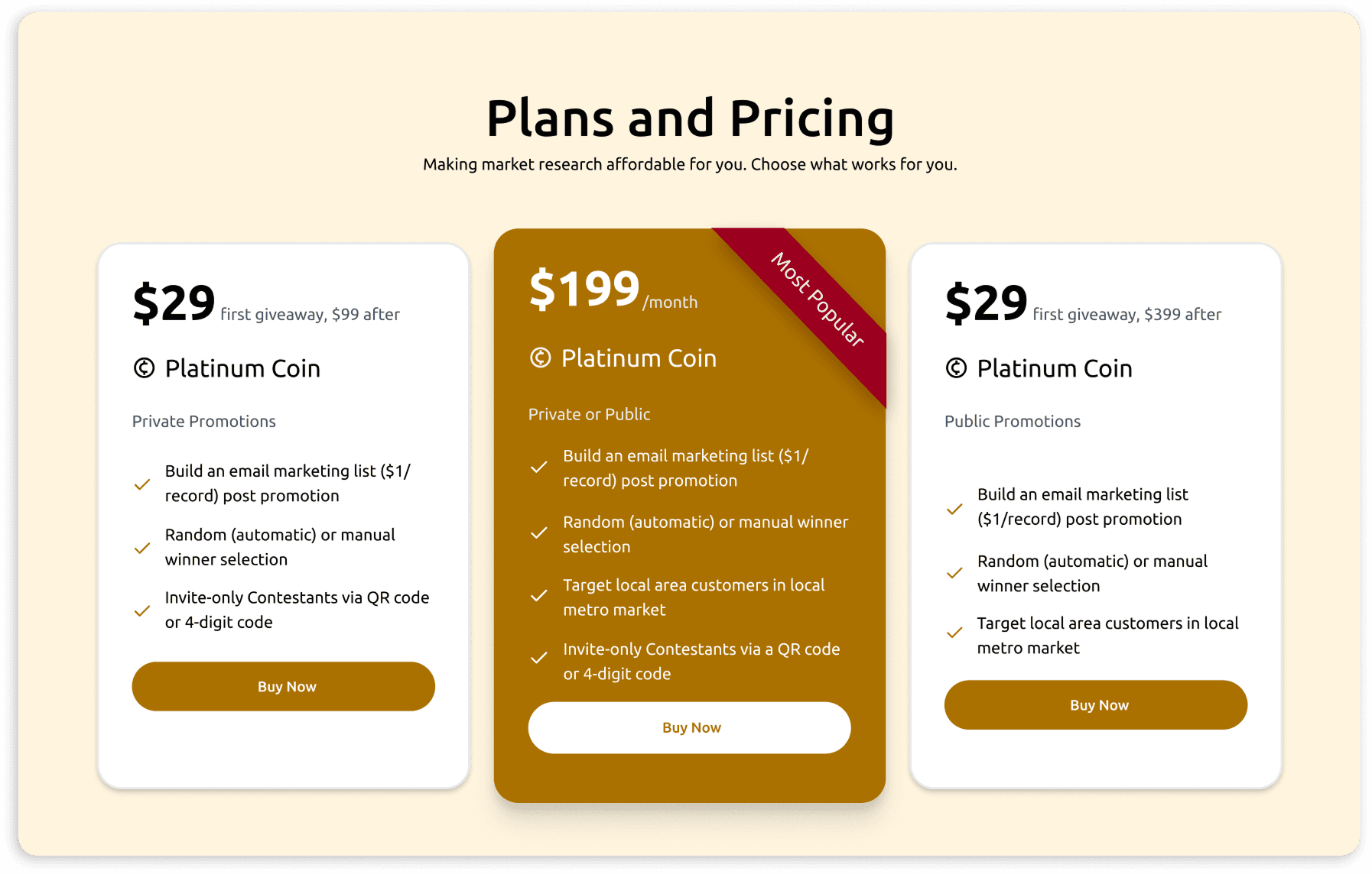
Pricing Transparency
In competitive research, I found that SMB-focused tools with transparent upfront pricing (like Squarespace, Canva) build trust faster than those requiring sales calls.
For price-sensitive small business owners, hidden pricing is a major friction point, 70% of surveyed users said they'd leave a site that didn't show costs upfront. Unlike enterprise B2B tools where "contact sales" is standard, SMBs expect self-service evaluation. Adding this section reduced bounce rates and qualified leads more efficiently by letting users self-select based on budget.
Comparison Table: Helping Users Choose
During secondary research, I learned that SMB owners actively compare 3-5 tools before deciding. Platforms like Asana and Notion successfully use comparison tables to guide this decision-making process. However, I noticed some competitors list features without context, making comparisons meaningless.
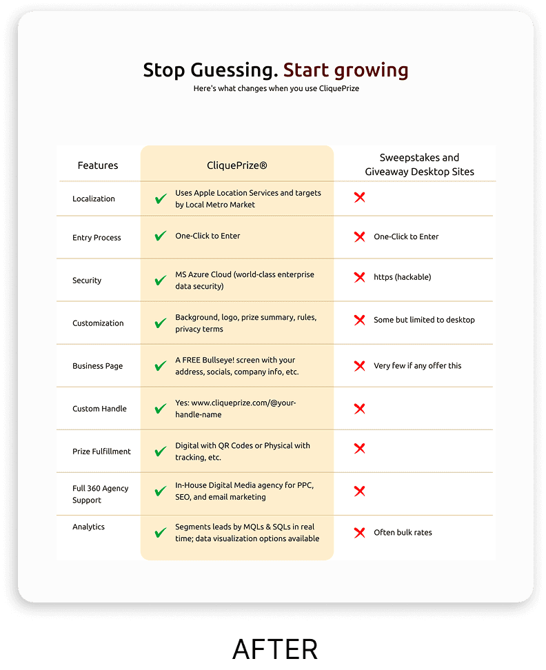
Instead of the blocks of text explaining why CliquePrize stood out, I designed this table to highlight CliquePrize's unique advantages (like geo-targeting) while being honest about feature parity where it exists, building credibility rather than making exaggerated claims.
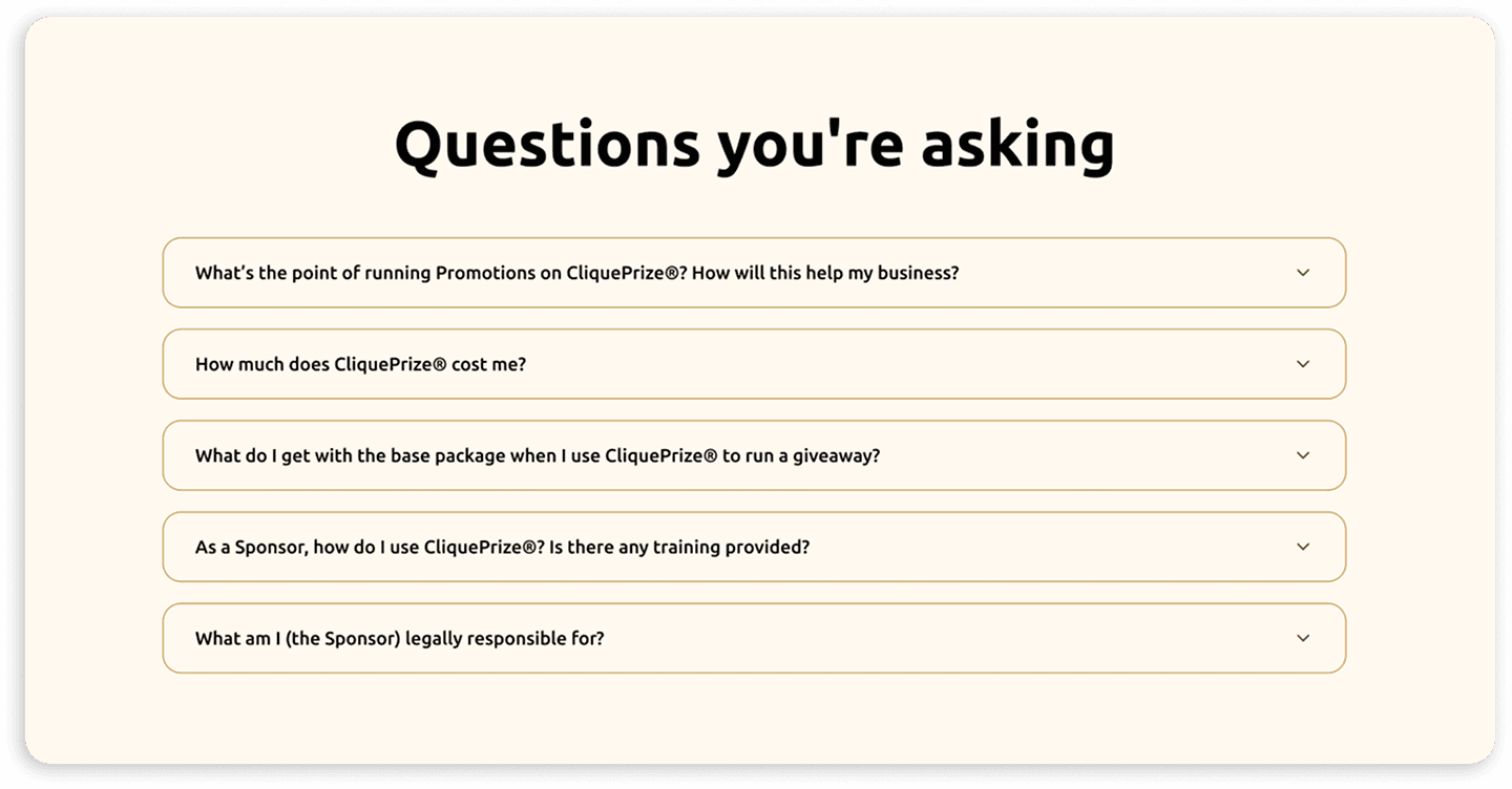
FAQ Section: Addressing Common Concerns
Successful SMB platforms like Wix and Shopify proactively address these concerns through FAQs positioned near CTAs. Unlike B2B enterprise sites where FAQs appear in footers,
I placed this section prominently in the user journey, right before the final conversion point, to reduce anxiety at the moment of decision. This mirrors the support a salesperson would provide in real-time, but in a self-service format.
IMPACT
WHAT I LEARNT
This project taught me that marketing sites aren't just about looking good, they're about answering user questions in the right order.
By stepping into the shoes of a busy small business owner visiting the site for the first time, I could identify exactly what information was missing, what was unclear, and what needed to be front and center.
Key learning: UX writing is design. Every word, every headline, every section order is a design decision that either helps or hinders the user's journey.